Small Bedroom Colour Ideas – What Actually Works (and What Doesn’t)
The advice for small bedrooms is almost always the same: paint it white, keep it light, avoid dark colours. It’s not wrong, exactly, but it’s incomplete — and it leads a lot of people toward a safe, slightly forgettable bedroom because they think their small room disqualifies them from anything more interesting.
The truth is more nuanced. Light colours do generally make a small bedroom feel more open, but “light” doesn’t mean the same thing as “boring,” and there are genuinely good reasons to choose a deeper, richer colour in a small bedroom under the right conditions. The relationship between colour and perceived space is real, but it’s also more specific than the blanket advice suggests — it depends on your room’s lighting, its ceiling height, how the colour is applied, and what you’re actually trying to achieve in the space.
This guide goes past the generic “keep it light” advice to give you a genuine understanding of how colour behaves in a small bedroom — which palettes work and why, when a darker colour scheme is actually the better choice, and the specific application techniques (ceiling colour, trim, accent walls) that make the biggest practical difference regardless of which colour family you land on.
How Colour Actually Affects a Small Bedroom
Before specific palette suggestions, it helps to understand the real mechanism behind the “light colours make rooms look bigger” advice, because understanding why it works tells you exactly when it doesn’t apply as strongly.
Light colours reflect more of the available light back into the room, which increases the overall brightness and reduces the contrast between the walls and any shadowed areas. Brighter, lower-contrast spaces are what the eye reads as “open.” This effect is strongest specifically in rooms with limited natural light, since there’s a real light-reflection mechanism doing the work.
In a small bedroom with excellent natural light, this mechanism matters less, because the room already has enough brightness that a slightly deeper wall colour doesn’t meaningfully reduce it. This is the genuine exception to the “always go light” rule — and it’s a bigger exception than most generic small-space colour advice acknowledges.
Colour also affects perceived space through contrast and boundary definition. High-contrast colour choices (a very dark wall against a bright white ceiling and trim, for instance) create a sharp, visible boundary that the eye registers as “the room ends here.” Lower-contrast schemes, whether in a light or a deeper colour family, blur those boundaries slightly, which can make a small room feel more continuous and less boxed in — a technique that works with both light and dark palettes, provided the contrast stays low.
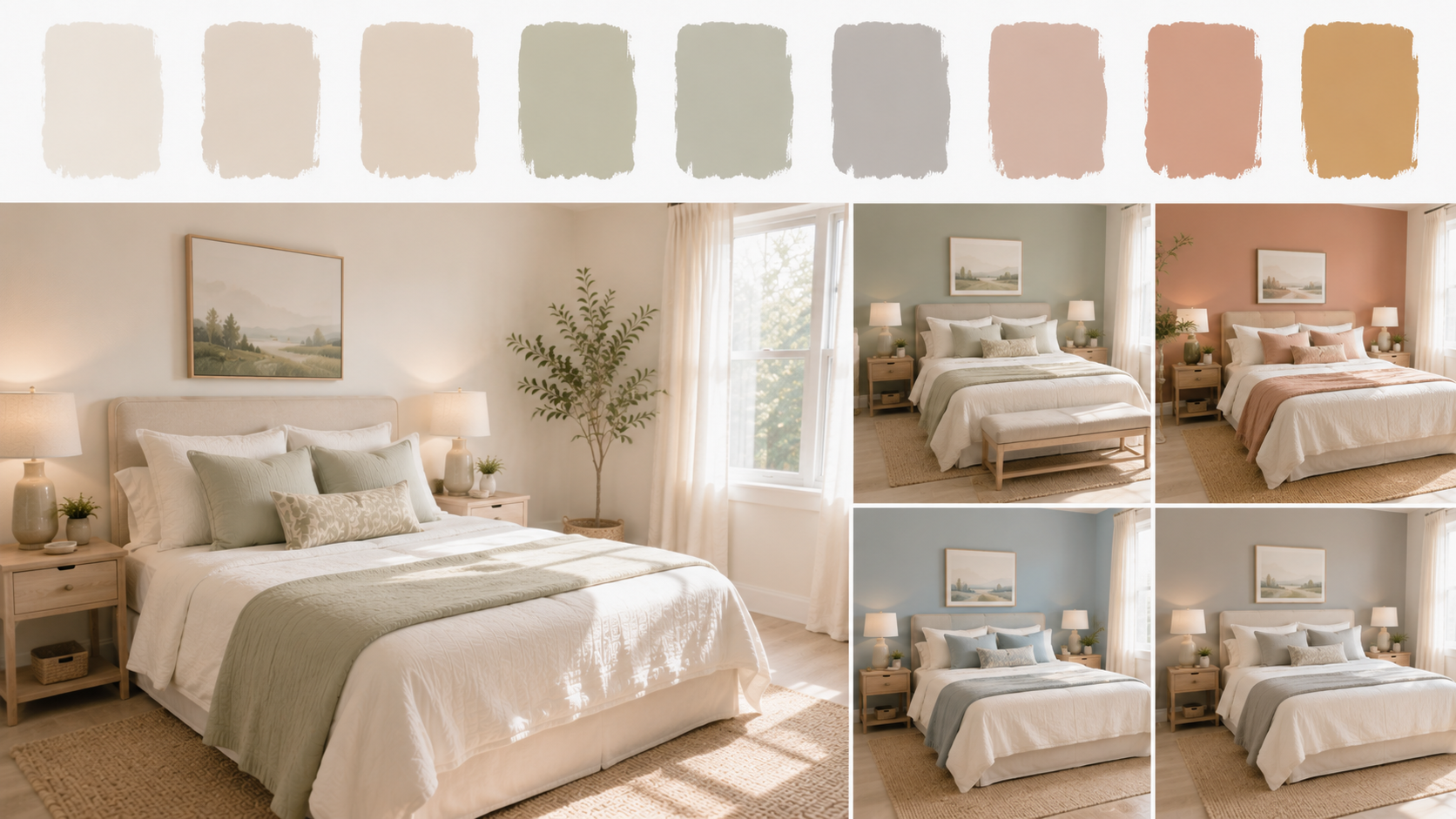
Small Bedroom Colour Ideas: Light and Airy Palettes
Warm Whites Over Stark Whites
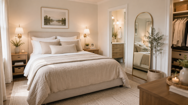
A pure, cool-toned white can feel clinical in a bedroom, particularly one with limited natural light, where the absence of warm daylight makes a stark white read as flat rather than fresh. Warm whites — with a hint of cream, beige, or even a whisper of pink undertone — maintain the light-reflecting benefit of white while feeling considerably more inviting in a room meant for rest.
Look for whites described as “warm white,” “off-white,” or with named undertones like “linen” or “ivory” rather than a true, stark white, which tends to suit brightly lit, larger spaces better than a compact bedroom.
Soft Greige and Warm Taupe
Greige — the grey-beige family — has remained popular for good reason: it reads as sophisticated without feeling cold, and it works with almost any accent colour or wood tone you might introduce through furniture and textiles. In a small bedroom specifically, a soft greige keeps the light-reflecting benefit of a pale colour while adding more visual depth and interest than a flat white.
Pale Sage and Muted Green
A soft, muted sage green brings a sense of calm and a connection to nature that pure neutrals don’t offer, while remaining light enough to preserve the room-opening effect. This has become one of the most consistently recommended small bedroom colours in recent years, and the reasoning holds up: it’s genuinely restful, pairs well with both warm and cool-toned furniture, and doesn’t read as trend-specific in the way a more saturated or unusual green might.
Blush and Dusty Pink
A very pale, dusty pink — closer to a warm neutral than a true pink — adds gentle warmth and a soft, restful quality without venturing into territory that reads as juvenile or overly sweet. This works particularly well in small bedrooms that get good natural light, where the pink undertone reads as a warm glow rather than a flat, saturated colour.
When Dark Colours Actually Work Better in a Small Bedroom
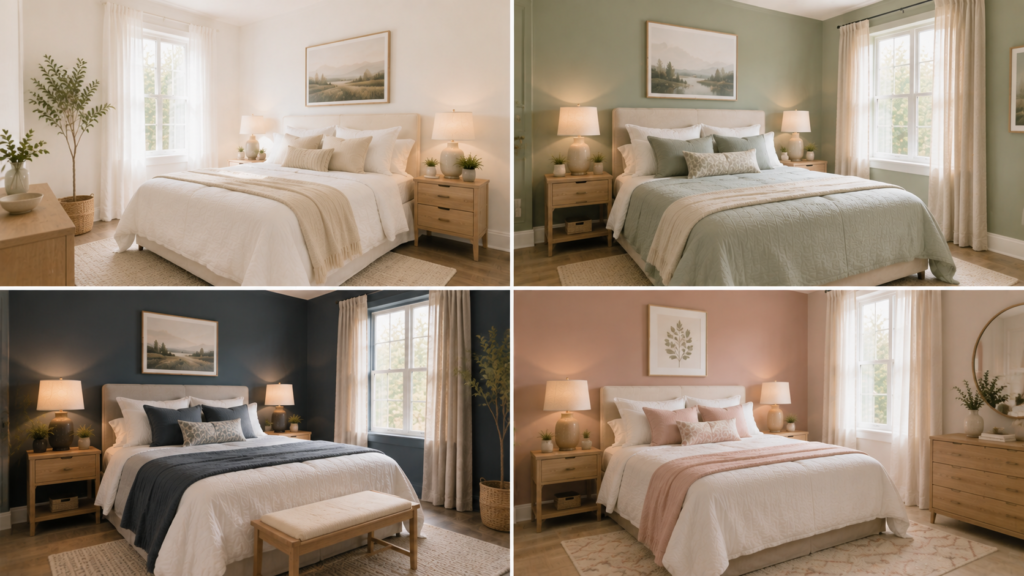
This is the part most small bedroom colour guides skip entirely, and it’s worth taking seriously: a dark colour scheme, applied correctly, can work beautifully in a small bedroom — sometimes better than a light scheme would.
The Cocooning Effect
A small bedroom painted in a deep, rich colour — charcoal, deep navy, forest green, aubergine — doesn’t try to disguise its size. Instead, it leans into an enveloping, cocoon-like quality that many people find genuinely more restful for a room whose primary purpose is sleep, rather than daytime activity where open, bright space matters more functionally.
This approach works especially well when the room genuinely has limited or no need to appear larger — a bedroom is not a room you’re trying to entertain in or make feel expansive for social purposes. If the room’s function is purely rest, a deep, enveloping colour scheme can serve that function better than a bright, open one.
The Conditions That Make Dark Colours Work
Good artificial lighting is essential. A dark small bedroom relies heavily on layered artificial lighting — a bedside lamp, a floor lamp, possibly a small chandelier or pendant — to keep the room from feeling flat or gloomy once daylight fades. Dark walls without adequate lighting genuinely do feel oppressive; dark walls with generous, warm lighting feel intentional and luxurious.
All-over application reads better than a single dark wall against light ones. Counterintuitively, painting all four walls (and often the ceiling too) the same deep colour tends to work better in a small room than a single dark accent wall against three light ones. The single dark wall creates the high-contrast boundary effect discussed earlier, which does make the room feel smaller and more chopped up. Full immersion removes that contrast and lets the room read as one continuous, enveloping space instead.
Warm undertones outperform cool ones for cosiness. A deep charcoal with warm undertones, a rich chocolate brown, or a warm forest green feel considerably cosier than an equally dark but cool-toned navy or slate grey, which can tip toward feeling cold rather than enveloping if the room doesn’t have enough warm lighting and texture to balance it.
Texture matters more in a dark room. Matte or textured paint finishes absorb and diffuse light more softly than a high-gloss finish, which can create harsh reflections in a dark, small space. Textiles — a substantial rug, layered bedding, curtains — add the tactile richness that keeps a dark room feeling luxurious rather than flat.
The Ceiling: The Most Overlooked Colour Decision
Why Ceiling Colour Matters More in a Small Bedroom
Most people paint the ceiling white by default, regardless of the wall colour, without considering that this creates a visible boundary line where the wall colour meets the ceiling — a boundary that, in a small room, draws attention to exactly how low the ceiling actually is.
Matching the Ceiling to the Walls
Painting the ceiling the same colour as the walls — or one or two shades lighter, using the same base colour rather than switching to white — removes this boundary line. The room reads as one continuous volume rather than a box with a distinct lid, which tends to make the ceiling feel higher than painting it a contrasting white would.
This technique works with both light and dark colour schemes and is genuinely one of the highest-impact, lowest-cost colour decisions available for a small bedroom, regardless of which wall colour you ultimately choose.
When White Ceilings Still Make Sense
In rooms with a genuinely low ceiling (under 8 feet) combined with very limited natural light, a white or very pale ceiling can help maximise whatever light exists, since a white ceiling reflects more light than a coloured one. This is a case where the specific combination of constraints (low ceiling, limited light) might outweigh the boundary-blurring benefit of a matched ceiling colour — worth assessing based on your room’s specific conditions rather than applying either rule universally.
Trim, Doors, and Woodwork: The Detail That Ties It Together
Matching Trim to Walls for a Seamless Look
Painting the trim (skirting boards, door frames, window frames) the same colour as the walls, rather than the traditional white, removes another set of contrast lines that can make a small room feel more segmented. This is a more contemporary approach and works particularly well with the “cocooning” dark colour scheme discussed above, since it supports the enveloping, boundary-free effect that makes deep colour work well in a small space.
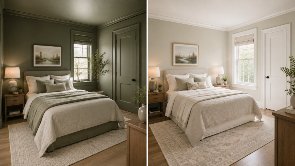
Contrasting Trim for a More Traditional Look
If a more classic, defined look is preferred, white or off-white trim against a coloured wall remains a perfectly valid choice — it’s simply working with a different visual logic, emphasising architectural definition rather than blurring it. This tends to suit period properties and more traditional interior styles better than the seamless, boundary-free approach.
Colour Application Techniques for Small Bedrooms
The Accent Wall (Used Correctly)
A single accent wall — typically the wall behind the headboard — in a deeper or more distinctive colour than the surrounding walls gives the room a focal point without the full commitment of an all-over colour scheme. This works well specifically because it’s positioned behind the bed, meaning you’re not looking directly at the high-contrast boundary it creates while lying in bed, and it draws the eye to the room’s most important visual element (the bed) rather than fragmenting the room’s overall sense of space.
The Colour-Block Half Wall
Painting the lower half of the wall (up to chair-rail height, roughly 32–36 inches) in a deeper colour, with the upper half and ceiling in a lighter shade, adds visual interest and a sense of grounding without the full-height contrast of a standard accent wall. This technique also has a practical benefit in small bedrooms — the lower half of a wall is more prone to scuffs and marks from furniture, and a deeper colour disguises this wear better than a pale one would.
Painted Ceiling as the Statement, Walls Kept Neutral
Reversing the usual approach — a bold or deep colour on the ceiling specifically, with the walls kept in a lighter neutral — creates a distinctive, often striking effect (sometimes called a “fifth wall” treatment) that adds real personality without affecting the room’s horizontal sense of space at all, since the walls themselves remain light and the boundary-blurring concern doesn’t apply to a ceiling-only colour statement.
Building a Complete Small Bedroom Colour Scheme
The Three-Colour Rule
A cohesive small bedroom colour scheme generally works best built around three colours: a dominant colour (the walls, and possibly ceiling), a secondary colour (major textiles — the duvet, curtains, a rug), and an accent colour (smaller elements — cushions, a lamp, artwork). Keeping to roughly this structure, rather than introducing many different colours across different elements, keeps a small room feeling cohesive rather than visually busy.
Undertones Matter More Than the Colour Name
Two paints both labelled “grey” can look completely different depending on their underlying undertone — one might lean warm (with hints of beige or pink beneath the grey), another might lean cool (with hints of blue). In a small bedroom, where the wall colour occupies a large percentage of the total visual field, undertone mismatches with your existing furniture, flooring, or textiles become more noticeable than they would in a larger room with more visual variety to dilute the effect. Always test a genuine paint sample on the actual wall, viewed at different times of day, before committing to a full room.
Test Before Committing
Paint swatches viewed on a small chip or even a full sample pot painted onto a section of wall can look meaningfully different once applied across an entire small room, particularly under the room’s actual lighting conditions rather than in a shop or under different bulbs. This matters more in a small bedroom than a larger space, since there’s less room for a colour miscalculation to feel like a minor, easily-balanced issue rather than the room’s dominant visual experience.
Quick Reference: Small Bedroom Colour Ideas
Light and airy palettes:
- Warm white or off-white (avoid stark, cool-toned white)
- Soft greige or warm taupe
- Pale sage or muted green
- Blush or dusty pink (warm undertone, not saturated)
When dark colours work well:
- Room has good artificial lighting to compensate for reduced natural light
- Applied all-over (walls plus ceiling) rather than as a single contrasting accent wall
- Warm-toned deep colours (charcoal, chocolate, forest green) over cool ones (navy, slate)
- Paired with textured finishes and layered textiles for warmth
Ceiling and trim:
- Match ceiling to wall colour (or one shade lighter) to remove the boundary line and raise perceived height
- White ceiling still makes sense in genuinely low, dark rooms needing maximum light reflection
- Trim matched to walls for a seamless look, or contrasting white trim for a more traditional, defined look
Application techniques:
- Accent wall behind the headboard for a focal point without full commitment
- Colour-block half wall for grounding and practical wear resistance
- Painted ceiling as the statement colour, walls kept light
Building the scheme:
- Three-colour structure: dominant, secondary, accent
- Check undertones carefully, not just the colour name
- Always test a real sample on the actual wall before committing
Conclusion
Small bedroom colour ideas go well beyond the standard “keep it light and white” advice — and understanding the actual mechanism behind that advice (light reflection, contrast, and boundary definition) tells you exactly when it applies strongly and when a different approach might genuinely work better.
Light, warm palettes remain a reliable choice for small bedrooms with limited natural light, and warm undertones consistently outperform stark, cool tones for making a compact room feel inviting rather than clinical. But deep, enveloping colour schemes are a legitimate and often beautiful choice too, provided they’re applied thoughtfully — all-over rather than as a single contrasting wall, paired with generous warm lighting, and built with enough texture to avoid feeling flat.
The details that matter regardless of which palette you choose — matching the ceiling to the walls, testing genuine samples under your room’s actual lighting, keeping the overall scheme to roughly three coordinated colours — do as much work as the specific colour choice itself.
Start by being honest about your room’s natural light and your own preference for an airy versus a cocooning atmosphere. Test genuine samples before committing to anything at full scale. Then build the rest of the scheme — ceiling, trim, textiles — around that core decision, rather than treating the wall colour as the only choice that matters.
Frequently asked questions:
Is white always the best colour for a small bedroom?
No, though it’s a reliable default in rooms with limited natural light. A warm white or off-white generally works better than a stark, cool-toned white, since pure white can read as clinical rather than inviting in a bedroom, particularly one without abundant daylight. Beyond white, soft greige, pale sage, and warm dusty pink all preserve the light-reflecting benefit that makes small rooms feel more open while offering considerably more character than plain white. And in rooms with genuinely good natural light or a preference for a cosier, more enveloping atmosphere, a deep, warm colour scheme can work very well too — white is a safe choice, not the only correct one.
Can you paint a small bedroom a dark colour?
Yes, and it can work beautifully under the right conditions. The key factors are: generous, warm artificial lighting to compensate for reduced light reflection, applying the colour all over the room (walls and often the ceiling) rather than as a single dark accent wall against light ones, choosing warm-toned deep colours (charcoal, chocolate brown, forest green) over cool ones (navy, slate grey), and adding enough texture through textiles and finishes to keep the room feeling rich rather than flat. A small bedroom is a room primarily used for rest rather than daytime activity, which makes it one of the better candidates in the home for an enveloping, cocoon-like dark colour scheme.
What colour should I paint the ceiling in a small bedroom?
In most cases, painting the ceiling the same colour as the walls, or one or two shades lighter using the same base colour, works better than the traditional white ceiling. This removes the visible boundary line where wall colour meets ceiling, which in a small room draws attention to exactly how low the ceiling sits. The main exception is a room with a genuinely low ceiling combined with very limited natural light, where a white ceiling’s superior light reflection may outweigh the boundary-blurring benefit of a matched colour — assess based on your room’s specific combination of ceiling height and available light rather than applying either approach universally.
What is the best small bedroom colour scheme for a restful atmosphere?
Soft, muted tones generally support rest better than bright or highly saturated colours, regardless of whether you choose a light or dark overall palette. Muted sage green, warm greige, soft dusty blue, and deep warm charcoal or forest green (if going for a darker scheme) are all associated with calm, restful qualities. Build the scheme around a three-colour structure — a dominant wall colour, a secondary colour in major textiles like the duvet and curtains, and a smaller accent colour in details like cushions or a lamp — rather than introducing many different colours, since a more cohesive, limited palette tends to feel calmer than a visually busier one.
How do I choose between a light and a dark colour scheme for my small bedroom?
Start with your room’s natural light: rooms with limited daylight generally do better with a light, warm palette, since there’s less natural brightness to offset a deep colour’s light-absorbing effect. Rooms with good natural light have more flexibility to go darker without feeling gloomy. Beyond light levels, consider what atmosphere you actually want — light schemes support an open, airy feeling that suits people who want their bedroom to feel spacious and bright, while dark schemes support a cocooning, enveloping feeling that suits people who prioritise cosiness and a strong sense of retreat. Both are valid; the right choice depends on your room’s actual light conditions and your personal preference for the room’s atmosphere, not a universal small-space rule.