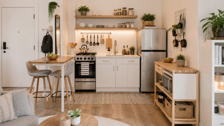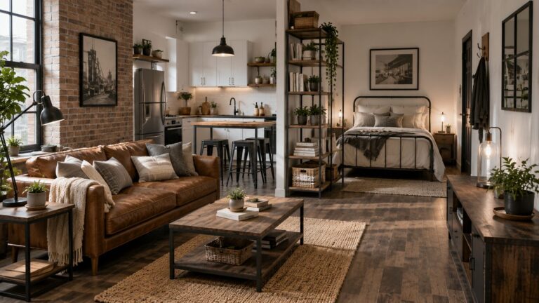
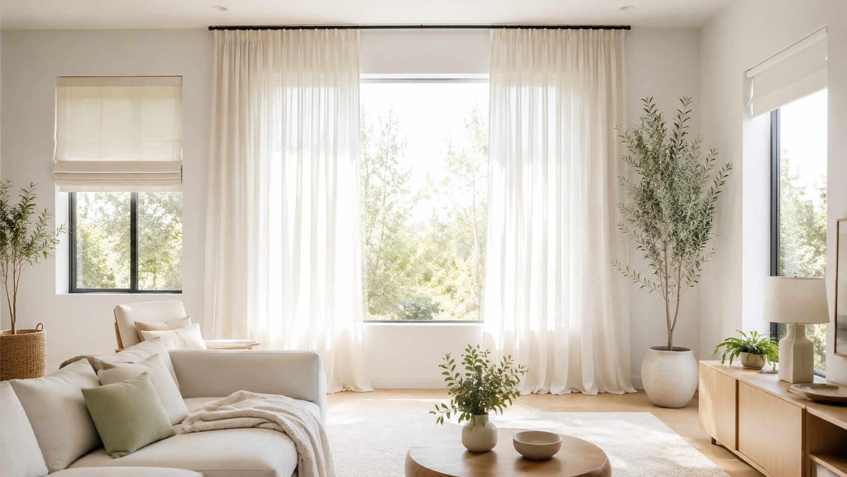
11 Tricks to Make a Small Home Appear Bigger
Square footage is a fact. How spacious a home feels is something else entirely.
Walk into a 600-square-foot apartment that’s been designed well and it feels airy, comfortable, and surprisingly generous. Walk into a 900-square-foot place that hasn’t been thought through and it feels tight, cluttered, and somehow smaller than it actually is. The difference between those two experiences has almost nothing to do with the number on the floor plan.
It has to do with how the space is designed.
There’s a set of tricks that interior designers use consistently in small homes — not gimmicks, but real techniques grounded in how the human eye reads a space. Some involve color. Some involve furniture scale and placement. Some involve light, mirrors, or the way a floor covering runs. Each one shifts perception in a specific, explainable way.
These 11 tricks to make a small home appear bigger are drawn from those design principles. They work across different types of small homes — compact apartments, narrow terraced houses, small cottages, studio flats — because the underlying visual logic is the same regardless of the floor plan. Most of them cost very little. Some cost nothing at all. And unlike renovation, they’re reversible if you change your mind.
Let’s go through all 11.
The Visual Logic Behind These Tricks
Before the list, it’s worth understanding the principle they all share.
The human brain reads a space as large or small based largely on visual cues — not the actual measurements. Specifically, it tracks three things: how far the eye can travel before hitting a visual boundary, how much light fills the space, and how complex or simple the visual field is.
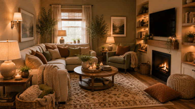
Tricks that make a small home appear bigger work by manipulating these three signals. They extend the visual sightlines, increase apparent light, and reduce the visual complexity that makes a small space feel crowded. Once you understand that, the logic behind each trick becomes obvious — and you can apply them more creatively beyond the specific examples given here.
Trick 1: Replace Heavy Window Treatments With Something That Lets Light Lead
This is the first thing most designers change in a small home, and it consistently delivers the most immediate visible impact.
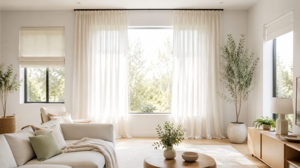
Heavy curtains, thick drapes, roman shades in a dark fabric, and layered window treatments all do the same thing: they reduce the amount of light entering the room and create a visual “frame” around the window that makes the window look smaller and the room look darker.
Light is the primary signal the brain uses to assess space. Dark rooms feel smaller. Bright rooms feel larger. Full stop.
The fix isn’t to strip windows bare (though bare windows in a private space aren’t a bad option). It’s to use treatments that maximize light while still providing privacy and dressing the window appropriately:
- Sheer linen panels filter light rather than blocking it, keeping the room bright even when drawn
- Roller shades in a light fabric roll out of sight entirely when raised, leaving no visual mass at the window frame
- Roman shades in a light, flat fabric stack compactly when raised, minimizing the fabric bulk at the top of the window
Hanging any of these as high as possible — ideally at ceiling height — and letting them fall to the floor extends the perceived height of the window and, by extension, the room.
Trick 2: Choose One Dominant Color and Stay Within Its Family
Color contrast creates visual boundaries. Every place where a strong color change occurs, the eye stops — registering that boundary as a wall, edge, or end point. In a small room, these stopping points accumulate quickly and the space starts to feel chopped up and tight.
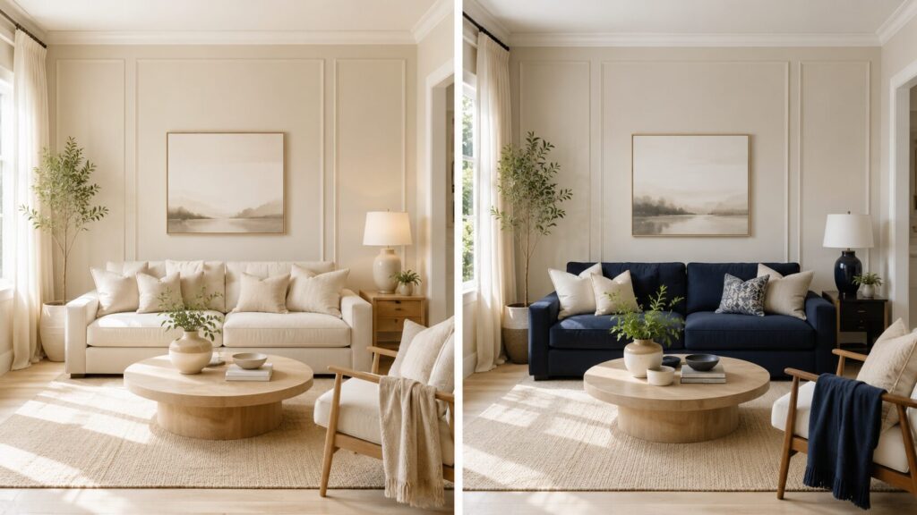
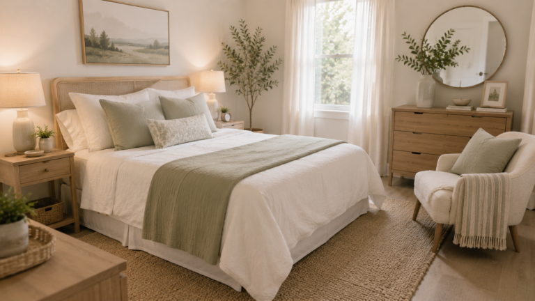
A monochromatic or low-contrast approach removes most of those visual interruptions. When the walls, large furniture pieces, and major soft furnishings stay within the same color family — varying in shade and texture rather than hue — the eye flows through the space without stopping. The room feels more continuous, more open, and larger than the square footage suggests.
This doesn’t mean everything needs to be the same shade. It means avoiding high-contrast pairings on large surfaces and large furniture. A cream sofa against pale greige walls in a room with warm wood tones and oatmeal cushions reads as expansive. The same sofa in navy blue against those same walls creates a visual jump that makes the room feel denser.
Save strong contrast for small moments: an accent cushion, a single vase, a piece of artwork. Let the large surfaces breathe.
Trick 3: Match Your Furniture to the Wall Color (Or Go Close)
This is a more specific application of the contrast principle and it’s worth calling out separately because it’s so reliably effective and so rarely intuitive.
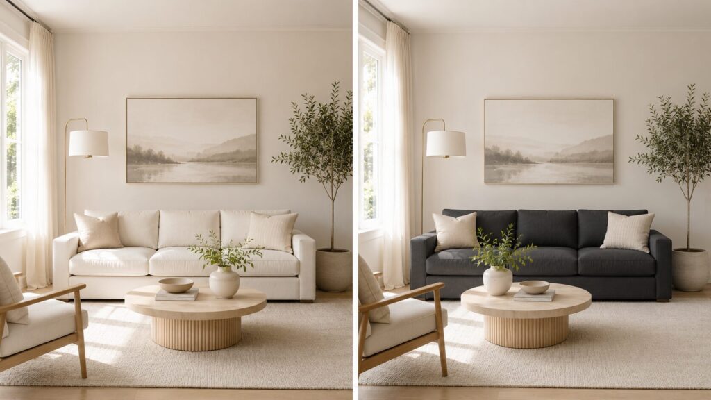
When a piece of furniture is close in tone to the wall behind it, the eye doesn’t fully register the furniture as a separate object. It blends, partially, into the wall. This means the furniture takes up less visual space — it’s there, functional, but not announcing itself as a boundary.
A pale sofa against a pale wall takes up less visual space than a dark sofa against a pale wall, even if they’re exactly the same size. A natural wood bookcase against a warm neutral wall recedes more than a dark painted bookcase in the same spot.
Designers call this technique “tonal dressing” — keeping pieces within the same tonal range so the room reads as one harmonious whole rather than a collection of competing objects. In small homes, it’s one of the most impactful tricks available.
Trick 4: Invest in One Large Rug Rather Than Several Small Ones
Rugs define zones. But in a small home, too many zones means too many visual boundaries — and boundaries make spaces feel smaller.
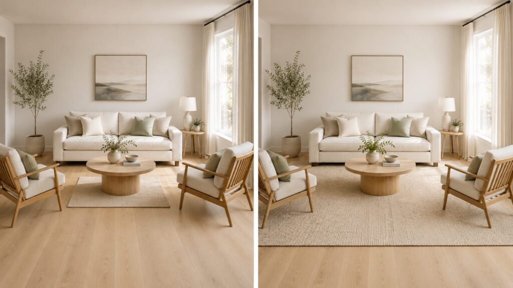
A common mistake in small rooms is using a rug that’s too small, which creates a floating island effect. The rug sits in the middle of the room, surrounded by a border of uncovered floor, and the eye registers multiple surface interruptions where there should be one continuous plane.
A single large rug that extends under most of the seating in a room — ideally with all front legs on it at minimum, all four legs if the rug is large enough — creates a unified floor plane. The eye reads this as one connected space rather than a fragmented one.
As a sizing guide: in a living room, aim for at least an 8×10 rug. In a bedroom, the rug should extend at least 18–24 inches beyond each side of the bed. Rugs that feel “too big” when you roll them out in the store almost always look better in the room than the one that felt like the “right” size.
Trick 5: Use Mirrors Intentionally — Not Just Decoratively
Mirrors expand space by creating the perception of depth. When positioned correctly, a mirror effectively adds a “window” into the room — the reflection suggests continuation of the space beyond the wall it’s mounted on.
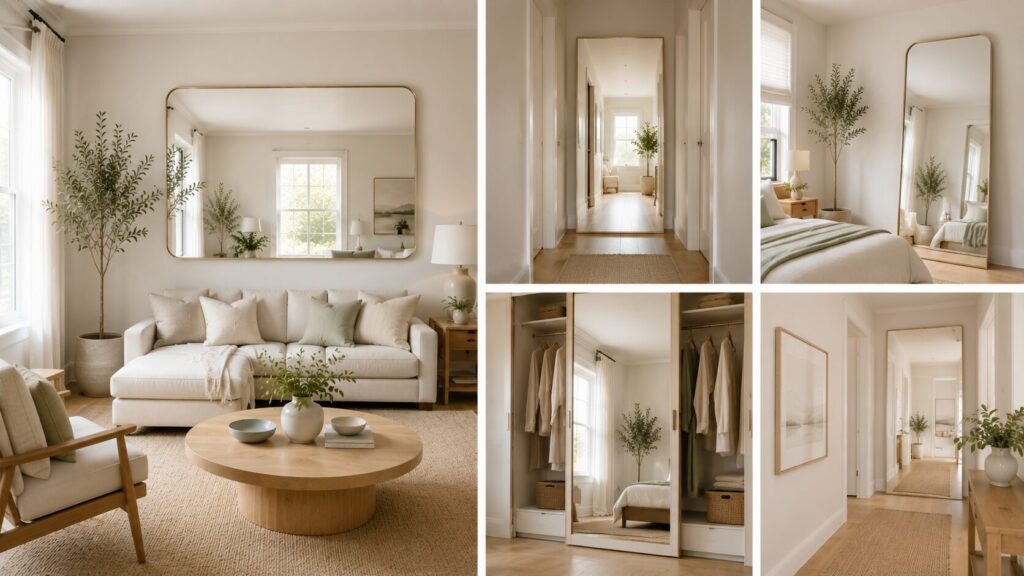
But mirrors only work this way when they’re positioned with intention. A mirror reflecting a blank wall across from it just shows you more of the same wall — it adds nothing spatially. A mirror reflecting a window, a light source, or the most open part of the room creates the illusion of a second opening, which is what actually makes the room feel bigger.
The rules for effective mirror placement in a small home:
- Position mirrors to reflect the most open or light-filled part of the room
- Bigger is almost always better — one large mirror outperforms several small decorative ones
- Full-length leaned mirrors on the floor work in bedrooms and hallways to dramatically extend perceived depth
- Mirror panels on a wardrobe door are functional mirrors that double as space-expanders at minimal extra cost
One specific trick: in a narrow hallway, a large mirror at the far end extends the perceived length of the corridor to twice its actual depth. The hallway reads as a continuation of space rather than a dead end.
Trick 6: Clear the Floor — More Than You Think You Need To
Of all the visual signals the brain uses to assess a room’s size, visible floor area is one of the strongest.
More visible floor = more space. It’s almost a direct equation.
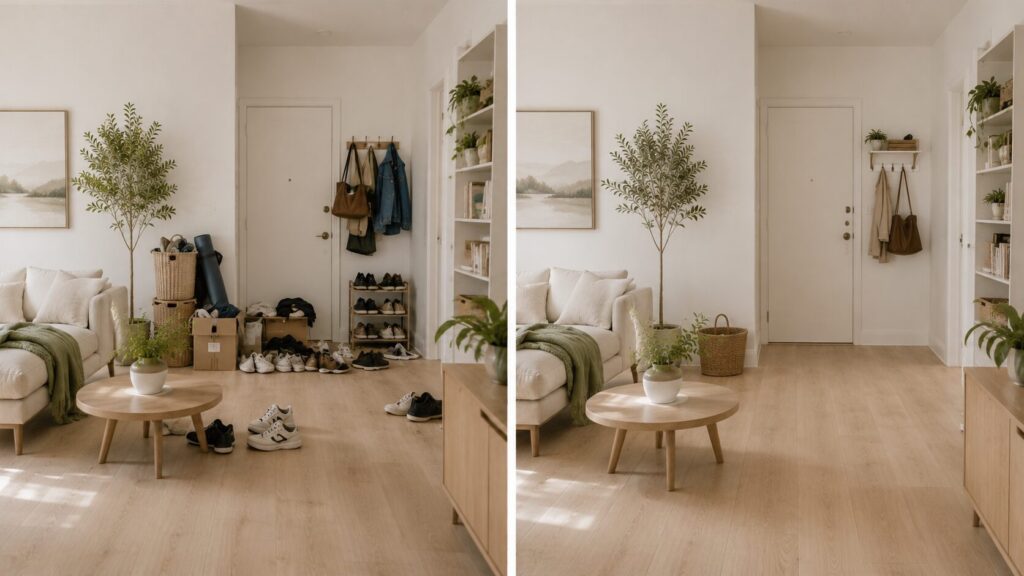
The things that eat floor space aren’t just furniture — it’s all the things that accumulate at floor level over time. Piles of shoes near the door. A basket that slowly expanded into three baskets. Boxes that were “temporary.” The exercise equipment that found a corner and stayed. Each of these items claims a section of floor and reduces the room’s apparent size.
In a small home, floor discipline is the most consistently high-value habit you can build. Not spartan minimalism — that’s a style choice. Just keeping the floor as clear as possible of things that don’t genuinely belong there.
The practical approach: build storage systems (wall-mounted, vertical, under-furniture) specifically designed to get things off the floor that would otherwise live there. Hooks for bags and coats rather than a pile near the door. Under-bed storage for shoes and seasonal items. Wall shelves for things that currently occupy a table or the floor.
The visible floor that results isn’t just aesthetically cleaner — it communicates “this space has room in it,” which is the exact signal you’re trying to generate.
Trick 7: Scale Furniture to the Room, Then Float It
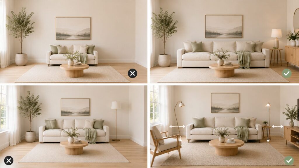
Two furniture mistakes consistently make small homes feel smaller. The first is buying furniture that’s too large for the room. The second is pushing all furniture to the walls.
Both mistakes come from the same instinct — the idea that smaller furniture and wall-hugging arrangements create more open space. They sometimes do create more physical space. But they often create less perceived space, which is what actually matters for how the room feels.
Why Oversized Furniture Is Sometimes the Right Call
A single sofa that fits the room properly — scaled to the wall it sits against — looks intentional and complete. A sofa that’s too small for the wall behind it leaves awkward empty spaces that signal the room has no room. Weirdly, undersized furniture can make a room feel smaller because it makes the space look like it can’t accommodate normal furniture.
The guideline: furniture should fill about two-thirds of the wall it anchors. A sofa facing a 12-foot wall should ideally be 7–8 feet wide. A bed in a 10-foot-wide room should use most of that wall width. This doesn’t mean cramming large pieces in — it means matching the scale to the room rather than defaulting to smaller.
Why Floating Furniture Actually Opens the Room
Pushing furniture flush against walls is the spatial equivalent of hunching — it’s defensive rather than comfortable. In most rooms, pulling furniture a few inches (or a few feet in larger rooms) off the walls creates depth between the furniture and the wall, which the eye reads as space. The room looks less like every piece is jammed in at the edges and more like there’s actual room to move through it.
Trick 8: Build Storage Up, Not Out
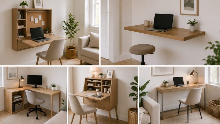
Every storage solution that lives on the floor competes with the clear floor space that makes a room feel large. Wall-mounted and vertical storage solutions — shelves, hanging systems, wall hooks, tall cabinetry — provide the same storage capacity while keeping the floor visible.
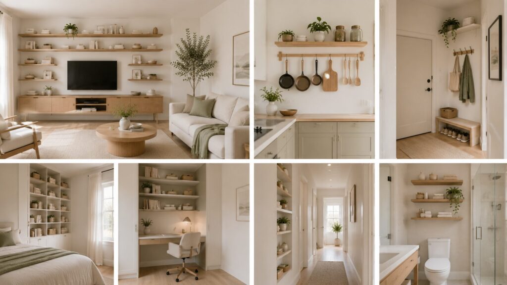
The higher the storage goes, the more vertical stretch the room gets as well. Floor-to-ceiling shelving doesn’t just store more — it draws the eye upward, which makes the ceiling feel farther away than it is. The room feels taller, and taller rooms always feel larger.
In practice, this means:
- Wall-mounted shelves in every room rather than freestanding shelf units where possible
- Tall, slim cabinetry over wide, low cabinetry
- Hanging rails and pegboards in the kitchen rather than under-counter storage alone
- Hooks on walls for anything that would otherwise go on the floor
- Built-in storage wherever wall depth allows it (shallow recessed shelves between studs, for example, use no floor space at all)
Trick 9: Extend Flooring Consistently Through Adjacent Spaces
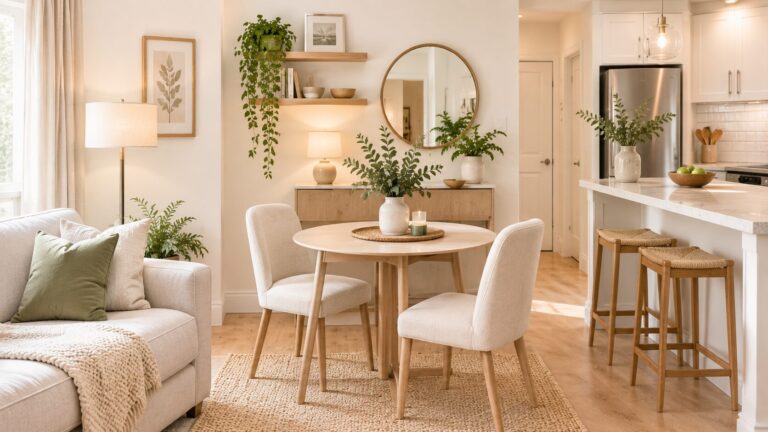
When flooring changes between rooms — wood in the living room, tile in the kitchen, different tile in the hallway — each transition creates a visual boundary. The eye registers each floor change as a new, separate box of space. The home starts to feel like a series of small boxes rather than one connected living space.
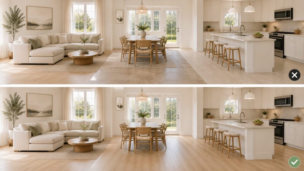
Consistent flooring through adjacent rooms removes those boundaries. The eye follows the floor from one space to the next without stopping. The home reads as one continuous space rather than several small connected ones. This effect is most dramatic in open-plan apartments and homes where the kitchen, dining area, and living room are all visible at once.
If changing flooring throughout isn’t feasible (it rarely is in a rental), consistent rug choices — the same material, similar tones — across different rooms creates a partial version of the same effect.
Trick 10: Rethink Your Lighting — Source Count Matters More Than Fixture Size
A single ceiling fixture in the center of a room creates a pool of light that fades toward the edges. The corners get dark. The perimeter of the room retreats visually. The room looks smaller because the edges disappear.
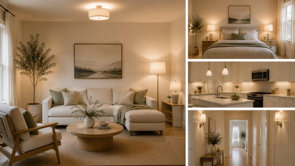
Multiple light sources at different heights — a ceiling fixture plus floor lamps, table lamps, wall sconces — distribute light through the full volume of the room. The corners stay lit. The perimeter stays visible. The room stays “present” throughout its full footprint.
The specific impact in small homes: when the edges of a room are lit, the eye can see all the way to those edges clearly. The brain registers the full size of the space. When the edges go dark, the brain registers only the lit central zone — which can feel significantly smaller than the room actually is.
Practically: aim for at least three light sources in any room where you spend significant time. A floor lamp behind the sofa, a table lamp on a side table or shelf, and the ceiling fixture covering the center already gives you this three-source distribution. Add under-cabinet lighting in the kitchen and a bedside lamp on each side of the bed in the bedroom, and the whole home benefits.
Trick 11: Embrace Negative Space as a Design Element
This is the hardest trick on the list for most people to accept, because it requires doing less rather than more. But it consistently distinguishes homes that feel spacious from homes that feel cramped despite identical square footage.
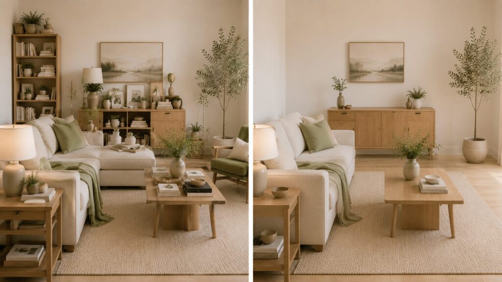
Negative space — areas in a room where nothing is placed — isn’t emptiness. It’s breathing room. It’s what makes the other elements in the room feel considered rather than accumulated.
In a small home, the temptation is to use every surface, fill every corner, and add more to make the space feel more comfortable and furnished. This almost always backfires. Every additional object competes for visual attention and adds to the complexity the brain has to process. More complexity in a small space reads as more crowded — regardless of how much physical space the objects actually occupy.
The version of a small home that feels spacious is usually the edited version. Not bare — but selective. The empty corner next to the bookcase isn’t a failure of decorating. It’s visual rest that makes the bookcase look better and the room feel larger.
A useful practical test: remove one item from each room. Live with the room for a week. If you don’t miss it, the room just got better. If the room needs it back, replace it. The process of editing almost always improves how a small home feels — and it costs nothing at all.
Quick Reference: 11 Tricks to Make a Small Home Appear Bigger
- Replace heavy window treatments — sheer panels or light roller shades hung at ceiling height
- Use a monochromatic palette — one dominant color, variations in shade and texture rather than contrasting hues
- Match furniture to wall tones — tonal dressing so large pieces recede rather than compete
- Invest in one large rug — unified floor plane rather than multiple small rugs creating visual fragmentation
- Use mirrors facing light sources — reflects the most open part of the room, not a blank wall
- Clear the floor ruthlessly — visible floor area is a direct signal of available space
- Scale furniture correctly and float it — right-sized pieces pulled away from walls create depth
- Build storage vertically — floor-to-ceiling storage clears the floor while stretching the room upward
- Keep flooring consistent between rooms — removes visual boundaries that make spaces feel like separate small boxes
- Layer three or more light sources per room — lights the full perimeter, keeping edges visible
- Protect negative space — empty areas are rest for the eye, not failures to decorate
Conclusion
Making a small home appear bigger isn’t about illusion or trickery in the cheap sense. It’s about understanding how the human eye reads space and designing deliberately so that every visual signal it receives says “this place has room.”
The 11 tricks in this guide work together rather than independently. Light-colored walls help more when the floor is clear. Mirrors work better when positioned near light sources. Large rugs work better when the furniture is properly scaled. The effects stack.
Start with the changes that cost nothing or nearly nothing — clearing the floor, editing the accessories, swapping light bulbs to warm white, positioning mirrors where they reflect light. These alone will shift how the home feels. Then layer in the changes that require small investments: new window treatments, a correctly sized rug, vertical storage that replaces floor-level storage.
The goal at the end of all of it isn’t a home that looks like a bigger home. It’s a home that feels generous, calm, and genuinely comfortable — where the square footage on the lease stops being something you apologize for and starts being just a number that tells you very little about how nice it actually is to live there.
That’s a home designed well. And it’s entirely achievable, whatever size you’re starting with.
What is the single most effective trick to make a small home appear bigger?
Maximizing natural light has the broadest impact. Light is the primary signal the brain uses to assess space — brighter rooms consistently feel larger than darker ones, regardless of actual dimensions. This means replacing heavy window treatments with sheer panels or light roller shades, hanging them at ceiling height, and swapping overhead bulbs to warm white (2700K). If you can only do one thing, maximize the light. If you can do two, add a large mirror positioned to reflect the window or the most light-filled part of the room. Together, these two changes do more work than almost any other single combination.
Does dark paint make a small room look smaller?
Not automatically — but it requires careful handling. Dark walls in a small room absorb light and reduce the brightness that makes spaces feel open. However, when a dark-painted room has excellent natural light, multiple artificial light sources, and furniture that contrasts the walls enough to be distinct, dark paint can actually make a room feel cozy and intimate rather than cramped. The risk with dark paint in a small home is compounding the darkness — if the room already has limited natural light, dark walls make it significantly worse. As a general rule, light colors are the safer choice in small homes, but dark paint can work if the lighting is managed deliberately.
Does open shelving make a small home look bigger or smaller?
Open shelving can go either way, depending on how it’s styled. Overcrowded open shelves add visual complexity and make a small room feel busier and smaller. Well-edited open shelves — following the 60/40 rule (60% filled, 40% open) — keep the eye moving freely and can make a room feel more open than closed cabinetry that creates a heavy visual mass. In small homes, open shelving works best when the items on it are consistent in color, limited in number, and intentionally arranged. Random accumulation on open shelves is one of the fastest ways to make a small room feel cluttered.
Does removing interior doors make a small home feel bigger?
Yes, in most cases — and it’s one of the most effective architectural tricks for small homes and apartments. Interior doors, when open, take up wall space and create visual interruptions. When removed, the doorway becomes an opening rather than a boundary, and the sightline through to the next room extends the perceived depth of both spaces. Many people in small apartments remove the doors between the living room and bedroom, or between a narrow hallway and the main room, with significant positive results. If removing doors entirely isn’t an option (for privacy or lease reasons), keeping them consistently open during the day achieves most of the same visual effect.
What furniture arrangement makes a small home look biggest?
The arrangement that keeps sightlines longest and the floor most visible. In practice: push the largest piece of furniture (usually a sofa or bed) against the wall that the eye naturally travels to when entering the room, leaving the center clear. Float pieces slightly away from walls — even 3–6 inches — to create depth. Keep lower furniture (coffee tables, benches) rather than higher pieces in the center of the room, so the visual field stays open. Route traffic along the perimeters of rooms rather than through the center. And keep the corners relatively clear — cornered furniture accumulation is one of the most common reasons small rooms feel smaller than they should.